Lucide
24×24 grid, 1.75px stroke, single-weight. Lucide's hairline geometry matches the editorial restraint of EB Garamond and the terracotta product layer. Load from CDN; never recolour stroke unless inverting for a dark surface.
lucide.dev →This document is the canonical reference for anyone creating on behalf of twin3 — Twitter banners, Discord posts, video stills, slide decks, landing pages, ad creative. It does not replace your judgment; it gives you the same starting palette, type, and tone as every other contributor, so the network reads as one voice across many hands.
Read this once and bookmark it. The rest of this page is a reference — colours, type, voice rules, templates. This section is the procedure: how to go from "I have an idea" to "the post is live" without the result feeling off-brand or off-tone. Seven steps and one checklist.
Three things to grab before drafting anything:
twin3-design.md from the card at the top of this page and paste it into your AI assistant (Claude / ChatGPT / Gemini) as custom instructions. Your assistant then critiques your draft against the same rules every other creator follows.twin3 has two accent palettes and they do different jobs. Decide which side of the line you are on:
If your piece bridges both — a launch announcement that links to the dashboard — let storytelling carry the hero and reserve terracotta for the single call-to-action that closes the piece. Never put mint and terracotta in the same line of type.
Visuals will mislead you about whether the words work. Draft the headline and the body in plain text, then run them through the three voice principles:
Cadence: headlines 3–9 words, body sentences 15–25, em-dash yes, ellipsis no, emoji at most one (usually zero). Read it aloud once before moving on.
For Twitter, pick one of the three canvases and lock the anchors from the Twitter section below:
For every canvas: kicker top-left (mono, mint, prefix ▸ + ISO date), title second (sans bold, gold, under 9 words), body bottom-left (sans, cream-dim, one line), mark bottom-right (Primary SVG, 48–72px, 0.85 opacity). Date format is always YYYY-MM-DD — never "May 11, 2026."
For non-Twitter pieces: respect the typographic hierarchy, the two-layer accent rule, and 1× clear space around the mark.
Eight items. If any are unchecked, the piece is not ready. The checklist is below this list — print it, keep it in your pinboard, run it before every publish.
Share the draft with one other creator or community member before you publish. They catch the things you went blind to — a number that contradicts itself, a typo in the kicker, a tone that drifted away from the brief. Don't ship without this step.
Drop drafts into the twin3 community Discord for casual review, or DM a fellow creator. Reviewers: be specific. "Looks good" helps nobody; "the headline reads as financial advice — propose 'X' instead" lands the fix.
Tag @twin3_ai on Twitter so the official account can amplify. Drop the link into the relevant twin3 community Discord channel so other creators see what shipped. Then walk away — don't reply-guy your own post for 30 minutes; let the work breathe.
This guide is versioned. v1.0 · 2026-05-12. The numbers in §9 of the AI Skill markdown
(141,872 humans, Coinbase listing date) are point-in-time — when you quote them, link to the source so the
reader can verify them fresh. We will rev this page when the rules change; the page footer always shows the
current version.
Two themes, three type families, two accent layers. Every other token in this system is derived from these — if you find yourself reaching for a colour or font not listed here, that is the design system asking you to stop and write back.
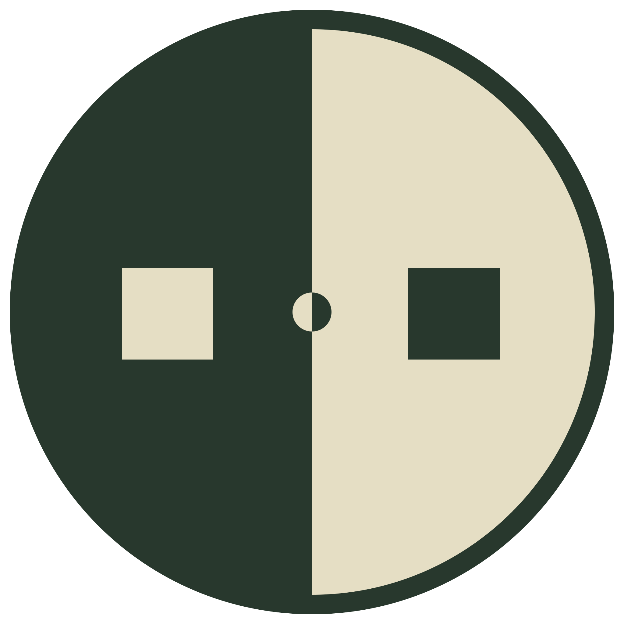
The mark is a split circle: forest-deep and cream, with mirrored squares offset from the centre. It reads as two halves of one identity — which is exactly what the network is. Treat the mark as a sealed object: never recolour, never warp, never reconstruct from parts.
Use Primary wherever the background is solid Cream, solid Forest, or a calm photo with sufficient contrast. Switch to Avatar for circle-crop or rounded-mask placements — Twitter / Instagram / Discord profile pictures, OAuth tiles, any surface that would otherwise show a white edge through the transparent corners.
twin3 doesn't ship a bespoke icon set. The defaults below cover every interface need we currently have. Pick from one library and stick to it — mixing icon families is a visual tell that breaks the calm-infrastructure feel of the brand faster than any colour mistake.
24×24 grid, 1.75px stroke, single-weight. Lucide's hairline geometry matches the editorial restraint of EB Garamond and the terracotta product layer. Load from CDN; never recolour stroke unless inverting for a dark surface.
lucide.dev →Treat the right-pointing small triangle as a brand asset, not a generic chevron. It prefixes every mono kicker, every ghost link, every download chip. If you reach for a different arrow / chevron / play glyph, stop — you're breaking the system.
Verified / pending / revoked statuses are rendered as mono UPPERCASE labels inside coloured pills (mint, amber, terracotta) — never as bespoke icon shapes. The typography is doing double-duty, and that's the point: fewer parts to maintain.
At most one emoji per post, usually zero. Never use emoji as a UI icon. Never use Phosphor, Tabler, Material, Heroicons, or any other set on the same surface as Lucide — pick one, stay in it.
If a needed icon isn't in Lucide, draw it in the same 24×24 / 1.75px / single-stroke hairline style. Don't add a second library to fill one gap — that's how design systems become wallpaper.
twin3 writes like a serious publication reporting on a serious thing. Calm, specific, true. The product is meaningful enough that it does not need to shout. These three principles are non-negotiable — everything else (humour, length, structure, language) is the creator's call.
Storytelling and product are different jobs. Storytelling moves people; product helps them finish a task. Each has its own palette, its own surface, its own typographic logic — keep them apart and the system holds. Mix them and the brand starts shouting over itself.
Photography and illustration choices are where most "calm infrastructure" brands quietly capsize back into Web3 hype clichés. Hold the line here.
When in doubt: would this image fit on the cover of a long-form magazine about infrastructure? If yes, use it. If it would only fit on a Web3 Twitter thumbnail, don't.
Three canvases cover almost every twin3 social use: profile header, in-feed post image, and square (for cross-posting to platforms that crop to 1:1). Each has fixed copy slots and a consistent corner-of-the-frame for the mark — so a fast-scrolling viewer can identify a twin3 post in under one second without reading.
kicker · mono · mint · 1 line · the network's job-to-be-donetitle · sans bold · gold · 1–2 words · usually just "twin3"body · sans · cream-dim · the one-line mechanism(4%, 8%)(4%, 30%) · max-width 60%(4%, 88%) · max-width 50%(96%, 92%) · 48–72px#1a2e20 → #0f1810kicker · mono · mint · category + ISO date (▸ ANNOUNCEMENT · YYYY-MM-DD)title · sans bold 64–80pt · gold · 1–2 lines maxbody · sans · cream-dim · 1 line, the proof(4%, 6%)(4%, 18%) · max-width 70%(4%, 88%) · max-width 60%(96%, 94%)▸ ANNOUNCEMENT + ISO date▸ HOW IT WORKS + topic▸ MILESTONE + numberkicker · mono · mint · categorytitle · sans bold · gold · headline number or 2-line claimbody · sans · cream-dim · the mechanism in 1 line(6%, 6%)(6%, 16%) · max-width 80%(6%, 82%)(94%, 94%)▸ — the triangle is part of
the system. Date format is always ISO (YYYY-MM-DD), never "May 11, 2026" or "11/5/26".
Keep the title under 9 words; if you can't, the title isn't done yet.
A small set of repeating elements that recur across product surfaces. These are not exhaustive — they are the building blocks creators most often need to mock up screens, slides, or announcement carousels. Use them as-is.
Motion should feel like paper, not jelly. Calm easings, short durations, no bounces or spring overshoot. The product is serious; the animation language has to match.
cubic-bezier(0.22, 0.61, 0.36, 1)Product surfaces: terracotta darkens to #A84327 on Cream / lightens to
#E58A66 on Forest. Other surfaces: paper colour shifts by 8% darker or
lighter. Never opacity-only — opacity hover reads as broken state.
Translate Y by 1px. No scale, no glow, no shadow shift. The element should feel like it's been physically pressed into the paper, not like it's about to launch.
2px terracotta outline at 4px offset on Cream; 2px mint outline at 4px offset on Forest. Always visible. Accessibility is not optional and outline suppression is the most common a11y regression — don't strip it.
Mono ellipsis or static skeleton bars in --bg-paper-sub. No spinners that
rotate forever; no rainbow shimmers. If the wait is over 2 seconds, surface a number
("loading 142 of 4,802 records") instead of an indeterminate animation.
@media (prefers-reduced-motion: reduce)
— drop transitions to 0ms, swap any translation/transform for an instant state change. The
design system's "no bounce" stance helps here: there's no playful motion to suppress, just
timing to flatten.
Everything on this page that you can take with you, in one place. The complete kit zip is the fastest way in if you're starting from a blank page; the individual files are here if you already have a working setup and just need one piece.
The whole starter pack — AI Skill (SKILL.md), design tokens
(twin3-tokens.css), canonical logo SVG + 2048×2048 PNG, avatar variant,
three Twitter canvas templates with the matrix-rain script, and a kit README walking
you through where each piece goes. Unzip, point your AI at SKILL.md, start designing.
twin3-design.md AI Skilltwin3-tokens.css CSSt3-* utility classes (buttons, pills, kickers, data badges).twin3-logo.svg Logotwin3-logo.png Logo · 2048twin3-logo-avatar.svg Avatartwin3-logo-avatar.png Avatar · 2048twitter-header.html Templatetwitter-in-feed.html Templatetwitter-square.html Templatetwitter.css Templatetwin3-tokens.css.matrix-rain.js Template.t3-tw__matrix container at the spec'd 80–100×50–70px grid.